The Helena Study Chart

The Original Chart
During their April, 2003 press conference, Sargent and Shepard presented
a PowerPoint presentation. This is slide 11 of that presentation.
The black circles represent the time the ban was in place.
The entire
PowerPoint presentation is available here (pdf).
.
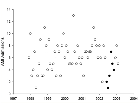
The Obvious Fraud
This is the same chart with the lines removed for clarity. Note that
the dip only occurs during the first three months of the ban, not
during the six months the researchers claim. In the forth month, there
were seven heart attacks, and in the following two there were five
and four respectively.
This is their own data, their own chart, and their fraud is obvious.
The only dip was during the first three months, not the length of
the ban, as the researchers claim.
Many thanks to Michael McFaddin who first pointed this out.
Notice the similar dip in 1998. This was ignored by the researchers.